| Author
|
Recent South Africa Flyer Designs
|
stu|ART

Started Topics :
2
Posts :
89
Posted : Feb 20, 2008 12:14:07
|
|
Farbo
Farbo

Started Topics :
21
Posts :
99
Posted : Feb 20, 2008 18:41
|
|
Login
IsraTrance Full Member
Started Topics :
65
Posts :
1707
Posted : Feb 21, 2008 09:17
|
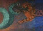
I dont like much the second one beacuse of the use of several font, elemnts are also too overlaped, its seems saturated.
|

|
|
stu|ART
Started Topics :
2
Posts :
89
Posted : Feb 21, 2008 09:55
|
@ Farbo - Nice 1 bro... thanks for the compliments
@ Login... interesting feedback. Looking back on that flier, i tend to agree with you on the too many fonts.
|
|
|
|
stu|ART
Started Topics :
2
Posts :
89
Posted : Oct 4, 2008 19:08
|
|
para||ax
Para||ax
Started Topics :
6
Posts :
68
Posted : Oct 13, 2008 16:32
|
|
para||ax
Para||ax
Started Topics :
6
Posts :
68
Posted : Oct 13, 2008 16:36
|
|
Overhuman
Overhuman Project

Started Topics :
29
Posts :
320
Posted : Oct 13, 2008 18:20
|
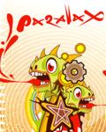
very nice saturations and vector shapes keep up!!!!
 30th of August first delivery money back. 30th of August first delivery money back. |
|
|
|
stu|ART
Started Topics :
2
Posts :
89
Posted : Oct 17, 2008 10:57
|
thanks for the feedback people...
@parallax I smaak that jungala flyer (and that font is tight man )
peace
stuart |
|
|
|
para||ax
Para||ax
Started Topics :
6
Posts :
68
Posted : Nov 7, 2008 11:14
|
|
stu|ART
Started Topics :
2
Posts :
89
Posted : Nov 10, 2008 10:02
|
very nice bro... like the colours and format.
|
|
|
|