| Author
|
Bengalien flyer ... critique needed
|
Yidam
Moderator

Started Topics :
144
Posts :
3171
Posted : Dec 13, 2007 13:06
|
greetings!
been working on a flyer for one of our events later this year and was looking for some helpful criticism in terms of text layout, font, spacing and even wording if possible.
(eg. the 2 rows for the lineup instead of one)
http://yidam.info/Epsilon_Med.jpg
links/references to other flyers or fonts are welcome!
thanks!  |

|
|
Gaialau
IsraTrance Junior Member
Started Topics :
34
Posts :
183
Posted : Dec 13, 2007 16:11
|
Over all i think this is great,nothing worse them getting an flyer where we cannot read a thing ,which is not your case ,as an personal opinium i would add an black stroke around main line up.
Here is an free link for fonts http://www.dafont.com/
 ---------------------------------- ----------------------------------
Hand crafted Trance belts and bags SHOP
http://www.etsy.com/shop/gaialau
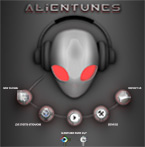
http://alientunes.com |
|
|
|
daya

Started Topics :
8
Posts :
307
Posted : Dec 14, 2007 00:56
|
Nice one Yidam, I my self never try yet doing a flyer ever. I like the void view in the alien eyes. Also the center grey light with the wave. Clean work and readable (most point of flyers and cd cover). If I am you, I will make all text in same font (maybe different size, style and colors), just to avoid the clash with the artwork which already killer. yeah contrashed aura/stroke/outline around the text will make it come out to the front.
founder http://www.enkienterprise.com
founder http://www.blacksheephybrid |
|
|
|
Yidam
Moderator
Started Topics :
144
Posts :
3171
Posted : Dec 14, 2007 09:52
|
much thanks for the feedback The stroke was a good idea Gaialau... makes it look cleaner
and thank you for those words daya... they mean a lot. trying to find a balance between readability and the sci-fi look of the header. will play around with it for a bit and post again sometime soon.
|
|
|
|
~Cortex~
IsraTrance Junior Member

Started Topics :
29
Posts :
237
Posted : Jan 24, 2008 11:56
|
I like the absolutely no glass... shit i can sneak drinks in... no weapons... well i aint a dangerous as i know of and illeagel substances.. shit i cant come in! LOL
Keep it up... change the font.. its not good! in london people would complain about reading it!
U.V Art & Design
www.divinemusictribe.com /www.echo-vortex.com
myspace.com/cortexuvarts/PsYcRoWdElIcA Festival
Supporting: EchoVortex Rec, Parvati Rec, Hypnotica REC |
|
|
|
Yidam
Moderator
Started Topics :
144
Posts :
3171
Posted : Jan 24, 2008 13:45
|
|
daya
Started Topics :
8
Posts :
307
Posted : Jan 24, 2008 22:57
|
|
Yidam
Moderator
Started Topics :
144
Posts :
3171
Posted : Jan 25, 2008 11:42
|
shukriya daya used photoshop 7.0 for this one. if you disregard concept, it's all really simple photoshop tricks to make things look 3D... mostly smudging, beveling, gaussian and motion blur filters.
http://www.graphic-design.com/Photoshop/ ... useful site to pick up tricks from ps experts
|
|
|
|
~Cortex~
IsraTrance Junior Member
Started Topics :
29
Posts :
237
Posted : Jan 25, 2008 14:16
|
Bro... what a beautiful space... i wish to be there and freak. Shame about the youth... they dont like to be aware hehehe. I saw the print on vinyl ... really impressive.. was that Ł€$ or something like that there?
U.V Art & Design
www.divinemusictribe.com /www.echo-vortex.com
myspace.com/cortexuvarts/PsYcRoWdElIcA Festival
Supporting: EchoVortex Rec, Parvati Rec, Hypnotica REC |
|
|
|
Yidam
Moderator
Started Topics :
144
Posts :
3171
Posted : Jan 26, 2008 12:22
|
t'was a case of using commercialism for the better good of alien mentality. printed those on the same vinyl thats used for massive advertising hoardings. 
u should be here sometime! we need more freaky people |
|
|
|